A Cluster-fun Part 2: 2022 CFB Group of 5 Review
Time to review the group of 5!
The 2022 CFB Season is still fresh in our minds, so now is the perfect time to take a moment to review what we learned this year. Last week, we reviewed the Power 5. This week, its time to put the group of 5 into the clustering algorithm and see what it spits out.
I won’t explain the process in its entirety because I did in the Power 5 article, but basically I input various adjusted and raw advanced metrics into the K-means clustering algorithm in order to group the Group of 5 teams together. Clustering is one of the most easy and effective ways to make observations on a large amount of teams and a large amount of data. If you’re newer to the newsletter (Welcome!) its sort of the bread and butter around here.
Without further ado, let’s get to clustering!
Group of 5 Team Tiers
Our Group of 5 Champion and Cotton Bowl Champion Tulane lead the way for the best of the best group. The Green Wave completed one of the biggest turnarounds from one season to the next. They went from 2-10 and 89th in F+ rating in 2021 to 12-2 and 22nd in F+. The American conference is well represented in the top two tiers, though with Houston, Cincinnati and UCF all departing for the Big 12, next season may see a new conference emerge as the Group of 5 leader.
“Luck” in this sense is an extreme wins above or below expectation. To get the “expectation” part, we simply summed up a team’s postgame win probabilities together and compared it to their actual wins. Teams in the lucky tier had a high wins above expectation, meaning they probably should have lost a game or so more than they did, while the unlucky teams probably should have won one of those closer toss up games. In the end though, wins are wins and the results do matter in a season regardless of the underlaying wackiness of those results.
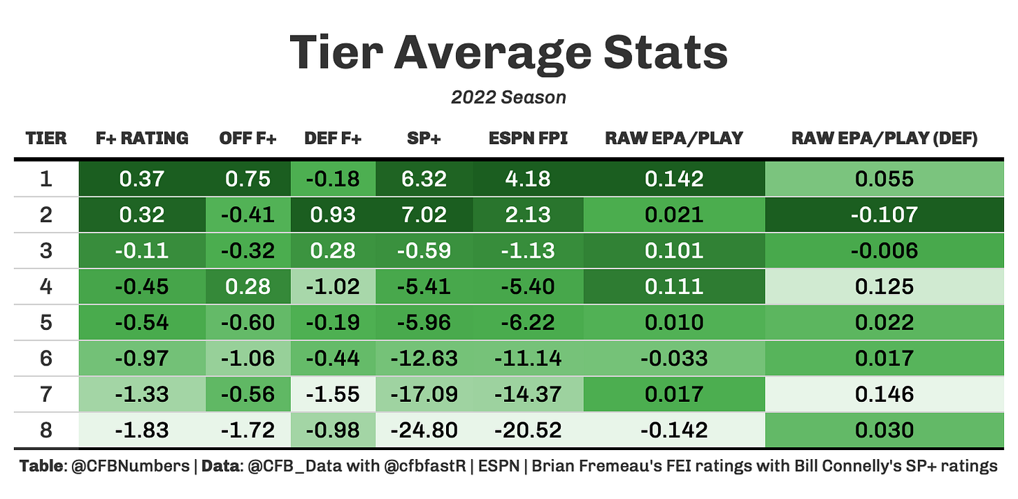
To get an even better idea of these tiers and why they were named a certain way, here is a big table of numbers that can better help explain what is going on:
The first and second tier are relatively close together in terms of average F+ rating, and they are a cut above the rest of the groups. Another way we can visualize the gap in tiers is to condense our variables into two dimensions so that can plot them on an X-Y graph. This is what the end result of that process looks like:
This really shows the gap between Tulane and the highest tier to lowly UMass and the lowest tier. Once you get to the middle to below middle tiers, it all because a little jumbled and chaotic. USF looks like its going to fall off the graph, largely due to their defense ranking last not just in the Group of 5 but all of the FBS in EPA/Play Allowed. On the flip side, you have an outlier in Marshall, who ranked 1st in the FBS in EPA/Play Allowed.
Offense/Defense Based On Expectation
Betting lines offer another way to look at how a team performed vs. their expectations. By looking at how many points a team is expected to score or give up vs. how much they actually did score or give up offers us another way to judge how a team did on one side of the ball.
You might be asking yourself “New Mexico State?”. I did too, so I did some digging and the answer is simply low expectations to start. Out of 64 Group of 5 teams, New Mexico State ranked 55th in total implied points from betting lines. They finished just below average in scoring drive percentage (33.6%), so they did technically beat expectations despite not being one of the best offenses. If you didn’t get to watch #MACtion this year, you missed out on a pretty fun Ohio Bobcats offense. They finished 16th in the FBS in pass EPA/Play, and 3rd in the group of 5. Their high flying passing attack earned them a trip to the MAC championship.
The most interesting name on this list is again those USF Bulls. The offense finished 64th in EPA/Play, so right around average. Unfortunately, the defense just wasn’t good enough and another poor season led to the removal of HC Jeff Scott. It will be interesting to see if new HC and former Tennessee OC Alex Golesh can build upon this league average offense and turn things around quickly down in Tampa.
Like I said before, the Marshall defense was one of the best in the country last year. Along with EPA/Play, Marshall also led the country in scoring drive percentage allowed (17.7%). Akron is another situation where they were expected to give up a lot of points (2nd most implied points allowed in the G5). The biggest storyline here is the UConn Huskies, who through the power of defense won 6 games and made a bowl appearance for the first time since 2016.
QB Clusters
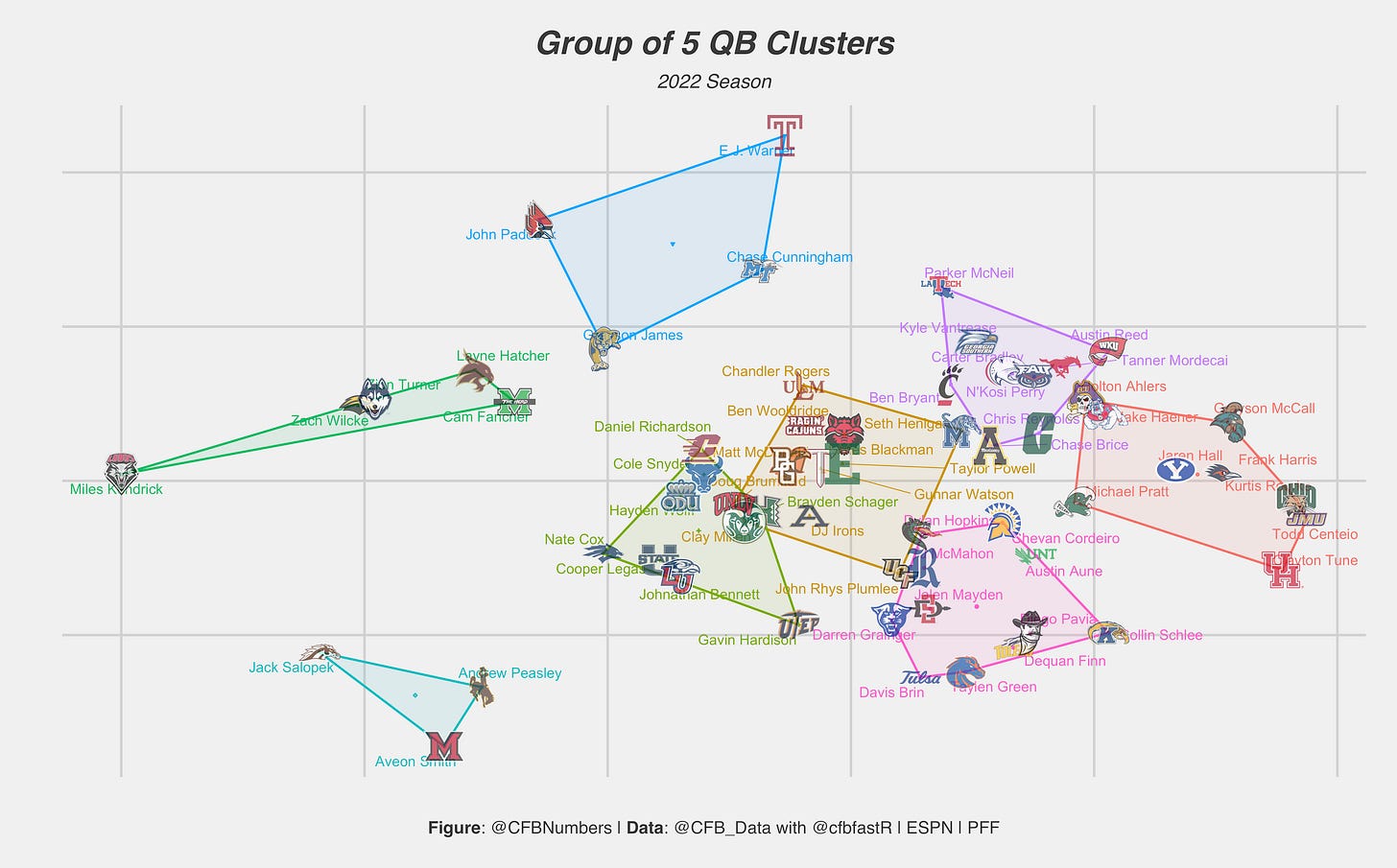
To wrap up the Group of 5, let’s cluster the signal callers. If you missed the power 5 article, essentially we’re using raw + opponent adjusted based stats and film/charted stats (PFF Grades, Big time throw rates etc.). This is the final result:
Grayson McCall, Michael Pratt, Frank Harris and Clayton Tune headline a strong best of the best tier. One of the biggest reasons for the Green Wave turnaround was the play of QB Michael Pratt. When Holton Ahlers got to East Carolina, they were stuck in the bottom of the AAC. His efficient QB play helped the Pirates turn the ship around, and they won 8 games for the first time since 2014. McCall, Harris, Pratt and Rourke are the only QBs in the top tier that are returning next season, so there are spots open to those in the second or third tier.
“Roller Coaster QBs” was actually a higher tier on the Power 5 graph because the power 5 QBs had a better ratio of positive plays to negative plays. The group of 5 roller coaster QBs were still overall a positive contribution in terms of efficiency, the ratio between positive and negative was a lot more narrow.
This is what the averages look like for the tiers. The first tier has a sizable gap in between them and everyone else in terms of PFF Offense Grade, while tiers 2-4 are all within a point of each other.
Finally, we can look at the X-Y plot to get a better look at how close these tiers all to one another. Tiers 1-6 are all relatively close to one another, while the last two tiers are a considerable distance from the rest of the pack.
That is the Group of 5 review and the entire FBS! This is just a really simple way to view an entire portion of the FBS at the same time. While clustering can occasionally lead you astray, it overall passes the eye test and helps with the beginnings of observation and narrative building.
If you want to dive in to the data like I do, check out @CFB_Data and @cfbfastR on Twitter, where you can learn how to get started in the world of College Football data analysis!
If you want to see more charts and one off analysis, follow my twitter page, @CFBNumbers


