
Simulating the 2024 CFB Season: Power 4
1000 simulations, so many possibilities!

Last week, we created a consensus preseason power rating system out of many preseason systems out there. Now that we have those done, we ought to use them! One of the ways we can do that is by simulating the entire season one thousand times in order to create some win expectations for each CFB team. Considering we have 134 FBS teams and 10ish conferences (Plus the Independents), its probably best if we split this up between the Power 4 conferences and the Group of 5 (Plus the Pac-2 and the Independents). First up, the Power 4!
Turning Spreads Into Percentages
First order of business, we have to turn our power ratings (which represent how many points a team is better than an average FBS opponent) into a percent chance to win in order to simulate our matchups. We can create “point spreads” by taking a teams power rating and subtracting it from their opponents power rating (FCS teams were given a point rating of -28, which would be the lowest among all FBS teams). We will also give each home team an extra 2.5 points to simulate home field advantage. Once we have that, we can look at historical win percentages based on how many points a team was favored over its opponent before the game.

In games with a spread of 0 (meaning both teams are about equal), teams are given a 50% chance to win the game. The more a team is favored by, the better percent chance they have of winning the game (I know, not exactly mind blowing stuff here). Once you get past 19.5 points, you’re basically at a 99.9% chance to win.
Now that we have our percents, we can simulate each game in the season, 1000 times. In each game, a team is assigned either a 1 for a win or a 0 for a loss. The teams percent chance to win the game represents its weighted odds to draw that 1. Once all the games are done, we can sum up their wins to get a win total for that season. We will also look at a teams win range based on all of the 1000 simulations, as well as how often they end up with the most wins in their respective conferences. Lets do it!
ACC Season Simulations

Each dot on this plot represents one of the teams 1000 season simulations. The dashed lines are set at 6 wins, or the mark of bowl eligibility. You can see teams like Pitt who are distributed evenly around the 6 win mark, while teams like Florida State and Clemson have much higher simulated win counts.

Along with a teams average wins, I included the 75th percentile outcome as well as the 25th percentile outcome in order to create a bit of a win range. It appears the range fluctuates between about 3-4 wins. At the top we have defending champion Florida State.
Currently, their win total on Draftkings sits at 9.5 (adjusted for odds its still 9.5), so our simulations are in line with the market. Even if you don’t bet, the betting market is one of the best sources of information we have, and we shouldn’t be too far off from their offerings. Teams the simulations are currently higher on than the market are ACC newcomer Stanford (4.1 sim wins vs. 3.3 DK win total) and Duke (6.5 sim wins vs. 5.9 DK wins). Teams with lower avg wins than the market include Miami (8.9 sim wins vs. 9.1 DK wins) and Virginia Tech (7.8 sim wins vs. 8.0 DK wins)
SEC Season Simulations


This is the first season for Texas and Oklahoma in the SEC. As you can see, Georgia and Texas lead the way in terms of average wins. It should be noted for “Most wins in conference” teams that tied for the most wins both received the nod which would explain the percentage shares being rather high. After UGA/Texas/Bama, we see the two teams that have been the most linked as “SEC sleepers”, Missouri and Ole Miss. Teams the simulations are much higher on than the market include Oklahoma (8.1 sim wins vs. 7.4 DK wins) and Alabama (9.7 sim wins vs. 9.2 DK wins). Teams with lower avg wins than the market include Tennesse (8.5 sim wins vs. 9.1 DK wins) and LSU (8.9 sim wins vs. 9.1 DK wins)
Big Ten Simulations


Oregon and Ohio State will play each other October 12th in Oregon for what will be one of the most anticipated games of the season. Both teams hit double digit wins in the vast majority of the simulations, and anything less than a playoff appearance would be a major failure. Penn State and Michigan make up our next teams up that should threaten for a playoff spot before we hit an average win gap between our next teams. Big Ten teams the sims were higher on than the market: Oregon (10.9 sim wins vs. 10.4 DK wins) and Penn State (10.6 sim wins vs. 10.1 DK wins). Teams lower in the sims than the market: Maryland (6.6 sim wins vs. 6.9 DK wins) and Washington (6.7 sim wins vs. 7 DK Wins).
Big 12
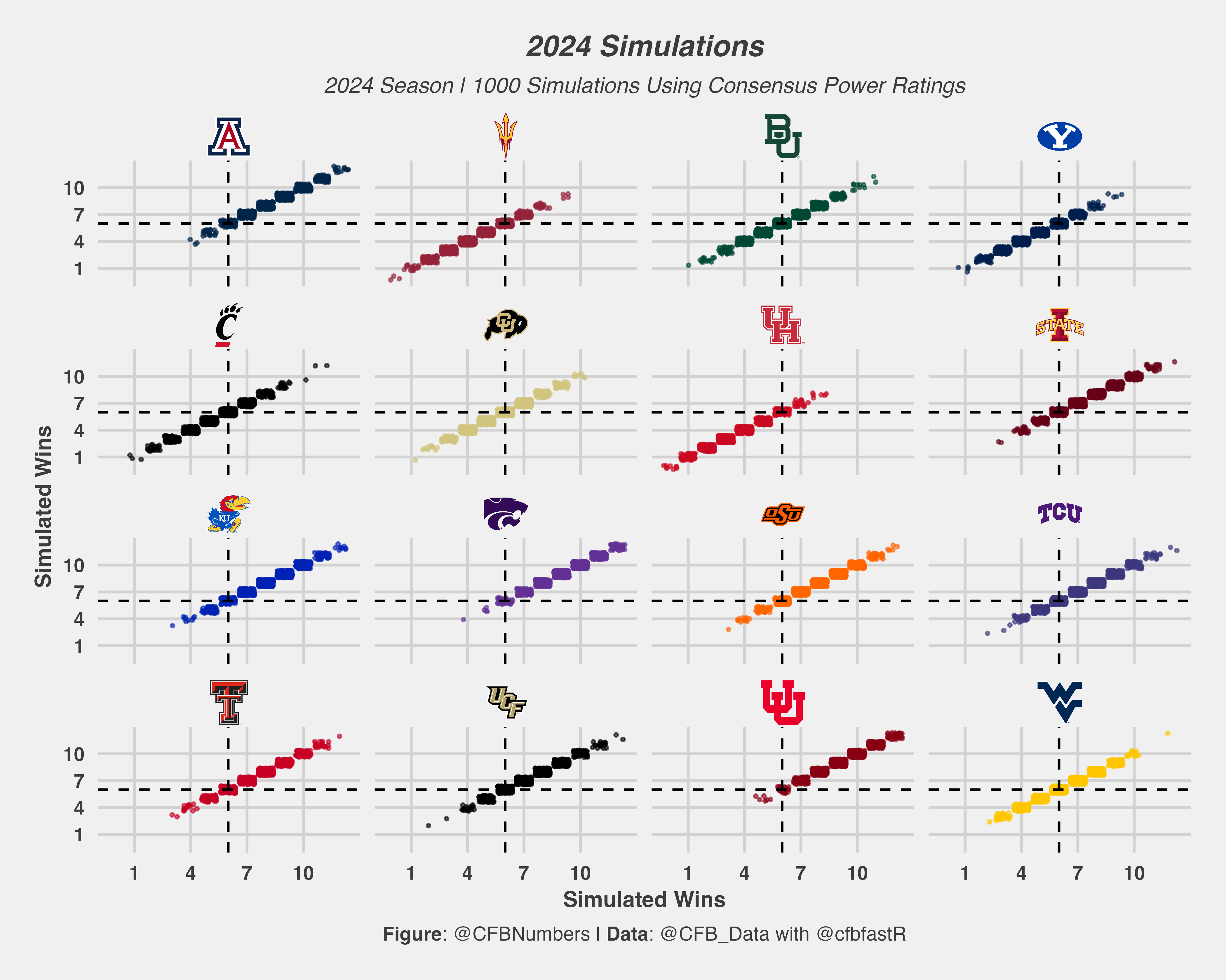

The Big 12 conference rounds out the Power 4 conferences and should be the tightest conference race out of the 4 power conferences. Kansas State and Utah are neck and neck at the top of the Big 12 race, but don’t count out the likes of Arizona and Kansas. Colorado HC Deion Sanders believes his team can contend for a CFB Playoff spot (which he should what else are you supposed to say). In our simulations, the Buffs will once again be fighting for a coveted bowl spot this season. Baylor represents our highest deviation from the market (6.0 sim wins vs. 5.0 DK wins), while Arizona represents the 2nd highest in the conference (8.4 sim wins to 7.8 DK wins). In terms of teams lower in the sims than the market: Utah (9.2 sim wins to 9.6 DK wins) and Houston (3.6 sim wins to 3.9 DK wins) are our most underrated.
FBS teams Avg Simulated Wins to Market Win Totals

For those curious, here is in the entire FBS simulated wins vs. their Draftkings win total. Only two teams (Baylor and Georgia State) have an average simulated win total a full win above or below their draftkings win total mark. So for the most part our win totals are largely in tune with what the markets are saying. Next week, we tackle the Group of 5 + Pac-2 + Independents!
Buy Me A Coffee!
https://www.buymeacoffee.com/CFBNumbers
As long as I do this newsletter I will keep it free so that as many people as possible can enjoy and join us on our CFB data adventure. However, if you did want to show additional support the newsletter (which you 100% do not have to!) you can always buy me a coffee here!
If you want to dive in to the data like I do, check out @CFB_Data and @cfbfastR on Twitter, where you can learn how to get started in the world of College Football data analysis!
If you want to see more charts and one off analysis, follow my twitter page, @CFBNumbers
Great work! Thanks for posting all of these. Was just looking through them, seems like the "Most wins in conference" column adds up to more than 100%, presumably because ties count as both teams finishing with most wins, in the event that, for example two or three teams all finish with 9 or 10 wins. Something to think about adjusting for in the future!
Visualization comment - I’m confused by the choice of scatterplots for displaying the distribution of simulated wins for each team (since y = x), why not just display bar charts or ridges instead?